
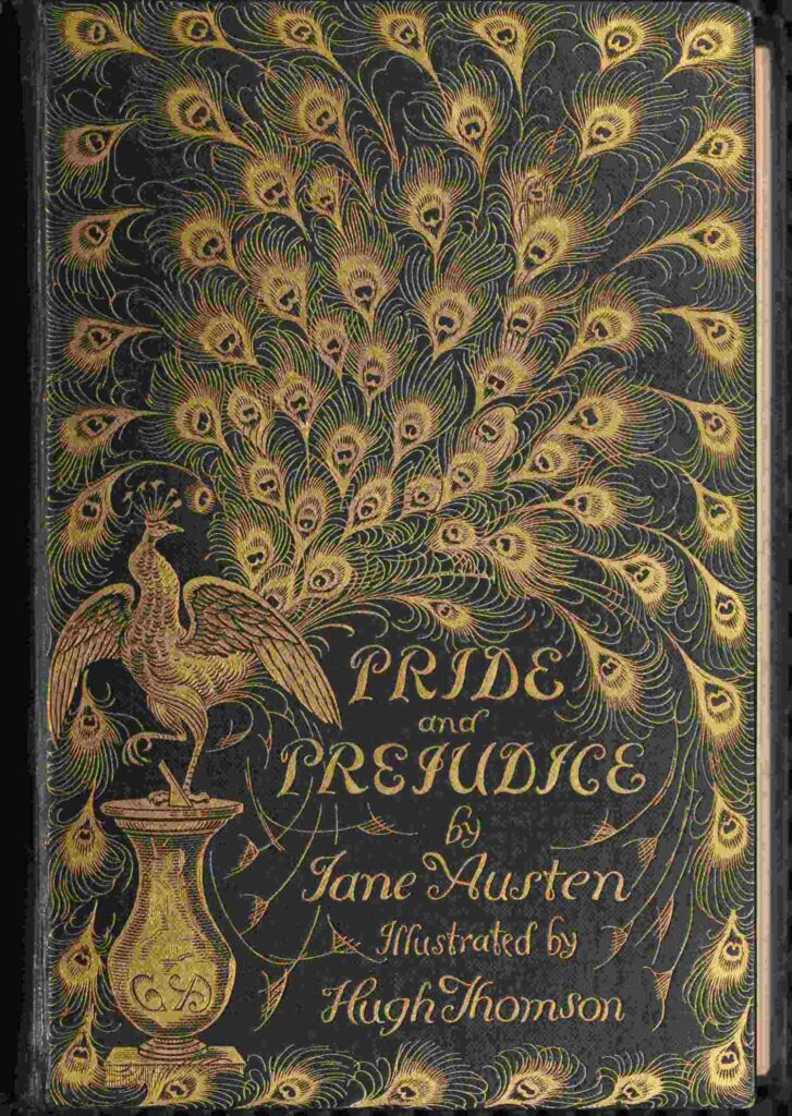
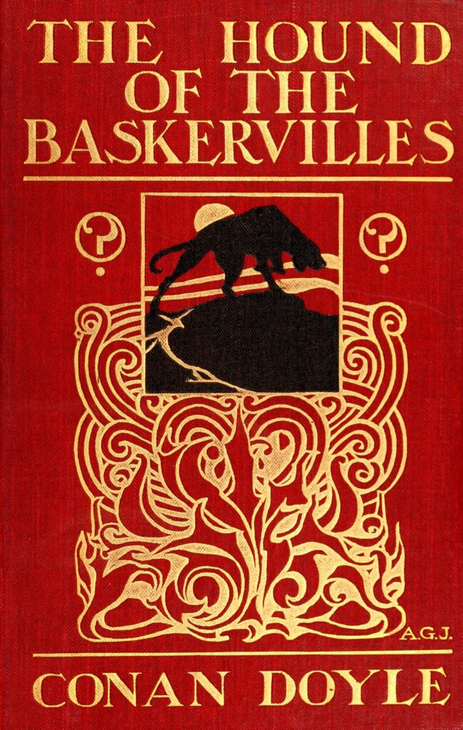
A binding introduces a book before its narrator can speak. Lettering, ornament and the balance of space suggest a mood and a kind of reading experience. Even a restrained design makes a proposal about the work it encloses.
The historic illustrated binding of Pride and Prejudice and the 1902 cover of The Hound of the Baskervilles offer useful objects for comparison. Neither should be treated as a neutral container.
Separate the object from the work
A novel can pass through many publishers and designers. An image associated with one edition is not automatically the cover of the first edition, nor does it establish the author’s intentions.
That distinction matters when historic book images circulate online. A beautiful object can acquire a misleading description if the edition disappears from the caption.
Look before interpreting
Start with what is visible: the hierarchy of the title, the size of the author’s name, the decorative forms and the amount of empty space. Then ask what expectation those choices create.
Comparing editions can become a form of close reading in its own right. The text persists, while each new physical presentation offers another invitation to understand what kind of story it might be.
Text and records consulted: Pride and Prejudice, historic illustrated edition; The Hound of the Baskervilles, 1902 cover.
Image: Historic binding reproduced in the Hugh Thomson illustrated edition. Public-domain scan. Image record. Archival image; not a photograph of a current event.
.jpg)